Monday, 21 November 2011

Assignment 2

  Preliminary sketches

I decided on my composition from these sketches by looking at light souses, angles and arrangements I felt the first  one was most successful as it made best use of negative space with the antlers finishing on the same line as the bottle.                      
                                  

Media.
I went with oil pastel as it could give the richness I was after as well as gives the ability to build up a large number of layers which I was going to need to capture the skulls form using colour.


Final piece.

I think that oil pastel was the correct  use of media for this piece. As I think the layers built up by it has given a good sense of form especially in the case of the skull. I also think the piece came together to create the richness I wanted.
However there are flaws in the prospective in areas of the skull as well as the bottle seeming to be tipped back on its self.

Monday, 17 October 2011

Drawing animals

What were the main challenges of drawing animals?
I found the main challenge to was weals drawing the pony that even tho I thort a horse stayed relatively still weals it grassed they as in fact constantly walking one foot at a time really slowly so a horse grassing is in fact for different positions. As well as this I found drawing in wing to be a challenge the bigger the paper the more so. Also the subject just wondering off created a challenge this can b seen in my fiber pen sketch and last pastel drawing with the proportions being wrong.


Which media did you enjoy using the most and which did you feel were best for the subject matter and why?

Sketching the pony I thort biro was the best media to capture the beast quickly how ever merging half pastels was the best media to capture it fluffy coat.
Working with the fish I thort a mix between water crayons and water pencils worked best with a white half pastel for the high lights. As these best captured the iridescence of the fish.


Where can you go to draw more animals. Have you tryed drwing an animal on the move yet?

I could try to draw the animals around my home or draw dogs at the part or go to a farm of zoo to find more animals to draw as well as what can be found naturally in fields. I had to finish a fiber pen sketch of a horse grassing weals the horse was on the move. Using a media like Biro or charcoal probably would be more successful drawing an animal on the move.


Research point.
                                                                                 Cat


Dog

                                                                       Horse


                                  George Stubbs. The fourth Anatomical table of muscles

George Stubbs's studies of horse's anatomy, particular of the bone and musal structure must of greatly informed his final pieces by enhancing his understanding a horses form and proportions even if the horse had moved out of the position it was originally drawn in.
I can see in my drawing of the pony that it would of greatly befitted from a studie of horse anatomy first as is poorly informed.


                                           George Stubbs. Bay horse and white dog


Research point.


Rearing Horse. Leonardo. 1503-04. Red chalk and pencil
This piece is interesting because it relay captors the hours and its characteristics throw its movement not just its positioning in its pose but the lines referencing how it moved in to its positions.
The horse's pose must of been captured in a quick sketch then the fine tone added later and details added later.

Friday, 14 October 2011

Drawing plants and flowers

How will your experiment with negative space help your observations in future?
It was defiantly a lesson in patients. I did notice by the end of the piece I was not having as much trouble spotting the shape of the negative space witch I was having great difficultly with in the beginning, especially when the space was made up out of the gaps in multiple layers. I did tho learn to just see negative space in the end witch made the drawing move along much faster. I also learnt that drawing negative space is easier when you have a single colour of flat background to help you distinguish.


Which techniques did you use to ensure your plants in proportion.

Mostly just careful observation constantly referencing against already drawn parts and the plant as well as using my pen to gage distances and angles.

How did you achieve an effect of three-dimensional space in your drawings?
In the negative space excises, three dimensional space is created throw perspective, mostly in the small grassy and furn type growth coming throw the negative space right in the rear of the picture.
Three dimensional space is created in the other pieces throw overlapping and tone created by form, made up out of multiple layers of coloured pencils, crayon, and fiber pens. Some times all three. I also sscratched back in to the Media experiment peace creating relief in layer in that way its physically three dimensional

Thursday, 13 October 2011

Drawing fruit and vegetables in colour

Research point: Ben Nicholson

Mousehole 1947, Ben Nicholson
Ben Nicholson had this unique style of simplify things such as still lives and adding them to Cornish landscapes. 
I think the reason for this is because he became influenced by Mondrain, wails in Paris, and his work in the neoplastic style influence him this abstract direction. Then Ben Nicholson later moved to St Ives.


Your composition should fit most of the paper's surface. How much negative space do you have left?

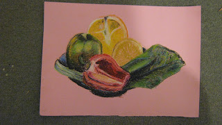
I think the banana's composition was a good use of space so I probably should of brought the pepper down lower so its bottom sat flat with the banana's stork. This would of removed more negative space. As for the pastel piece the there is also far to much negative space but it dose create a nice border for the piece. I should of scaled up the image more until it almost touched both sides of the paper and mover the hole piece down so the orange would still fit.


What have you learned from drawing the details of fruit and vegetables?
From the drawing of the details of vegetables I have mostly learned about the intricacy's of the insides of peppers and the textures of a banana's skin as well as pen and ink gives a nice contrasted and an ability to create finer detail wels working with fiber pens.


What did you find challenging on this part of the course?

I found learning how to build up oil pastels to create a 3D affect most difficult. Starting from the dark and working to light over numerous layers. I wasn't having much luck with it but as more and more layers were added it all came together and its now my favorite piece that I've done so far.


Wednesday, 5 October 2011

Still life

What aspects of each drawing have been successful, and what did you have problems with?
I think in general the line drawing was more successful than the tone piece I think mostly because of the simplistic indications of texture were quite successful like the stippling on the orange and the texture of the banana. Aspects I think were less successful were the other half of the pepper not especially looking like a pepper and the boll not having the correct shape. I need to work on drawing curbs more.
The other tonal peace had less successful aspects but I do like the vibrancy and freeness of it. Less successful elements are the composition, with it being to bunched up and makes the piece look untidy.


Did you manage to get a sense of depth in your drawings? What elements of the drawing and still life groupings helped to create that sense.

The depth is captured in the line drawing by mostly having the objects bunched together on a plait but with a letus leaf in the foreground that over laps with the plait and a banana resting on the plat of to one side. the overlapping creates the depth.
     In the tone piece the depth is partly created by tone and the over lapping of objects but also the banana that is set way back from the rest of the objects.

What difficulties were created by restricted to line or tone?

 Being restricted to line makes suggesting form harder by not being able to use the fall of light to describe the object such as the right had side of the pepper.
     Using only tone and pastels presented difficulties in judging detail as you don't have the skeleton to add the meat to, as you usually do so I found myself orientating around the picture using the original blocks of dark tone laid down.


Tuesday, 4 October 2011

Detailed observation

Which drawing media did you find most effective to use, for which effects?

The softer pencils were great for creating a smooth merging tone and could give depth as well if harder pencils were worked in before hand or after. So pencils were really good for accurate tone. Ball pionts were far better for hatching or bold lines, blocks of solid tone or stippling as each dote has more presents.


What sort of marks work well to create tone, pattern and texture?

Hatching and cross hatching works really well to create tone. Stippling works well to create pattern, repeated lines can also do this.


Did you enjoy capturing detail or are you more at home capturing big broad brush sketches?

I do ordinarily enjoy capturing detail and if any thing doing this curse has tort me to not try to include excessive detail. However by pencil sketch did not capture the detail of tone I'd wanted because, I was drawing such a small fir cone bud that I had trouble with my observations and the detail suffered because of this.


Look at the composition of the drawings you have done in this project. Make some sketches and notes about how you could improve your composition.

I think the composition of both pieces is ok both being central and use as much of the paper as possible wels still fitting it.
I could perhaps of got a more interesting composition by keeping the size of the items the same but moving them right to one side to create more negative space on one side than the other. 

Did doing a line drawing get you to look at space more effectively?

Yes I think it has because all a line drawing really shows is application of space and an objects form comes down to the space in and relationship of the lines. There for makes you really look at the space between lines cos that such a large part of the piece.

Monday, 3 October 2011

Exploring coloured media

Research point
The Vanities of human life.
Harmen Steenwyck, Oil on oak.
This is a cerfully observed painting that captures the detail of the reflected light. This creates a detailed texture. The composition also captures a lot of detail such as the book being open for the lay of the pages to be captured.

Polygonum Amplexicaute. Charles Mahoney.
I unfortunately have not been able to copy to my blog on this occasion.
This piece a very detailed botanical studie witch must of been incredibly closely observed. There is little negative space as the space is used up with further detailing to best describe the plant in a single composition. Good use of line and pattern that captures the liefs and stalk as well as a great capture of colour giving detailed accounts of dying liefs.


I found the verents of the pastels very expressive and interesting to use as I didn't know up until today, that what I had perversely always used was half pastels and I'd just assumed soft and oil were the same. I think it was the soft pastels witch I found most expressive due to the fluidness in witch they can be used and the ease of merging colours. But they cant give that waxy effect other pastels or crayons can.

Oil pastels:  Did not merge the same way but could be applied really heavily and then scratched back in to with a lot more detail than I thort.

Half pastels: Merge brilliantly as well as can give a bold line but don't build up the same as oil or have quite the vibrancy.

Wax crayon: can give a lovely waxy colour but cant match oil pastels and are weaker when working back on top of a piece nor merge like half or soft pastels.

Markers: Great for hatching or a solid block of black but lacks the subtlety and fineness of a biro or coloured pencils.

Colour pencils: Can be worked Finley and good for fine hatching or shading but lack at laying down a block of colour with any real presents.

Ink: with a pen it can create a fine line but lacks the predictability of a pen (not necessarily a bad thing) It can also be used as a wash if waters then worked in. Using a brush with ink gives a much thicker line than a nib would.

Ink and pen, and colouring pencils defiantly lend them self to finer more detailed work over pastels and crayons.

The technique and experiment I most enjoyed were the use of soft pastel to merge colours together starting from the lightest and oil pastels to build up a thick layer to scratch back in to. I'm looking forward to applying these techniques.


Assignment 1

I feel as tho I'd done enoff preliminary work before starting man made objects final piece as it just all felt like a natural progression from piece to piece to an ending I'm happy with.
         The natural objects final peace however I feel could of done with at least one more preliminary peace after I moved the cherry tomatoes right in to the foreground as I think the shadows would of benefited from some prier experimentation before the final piece in there new positions.

My finale man made piece seems to have the razor out of proportion but I think its more the cluster of objects behind the razor although in proportion to each other are out of proportion to the piece its self as they my be to small but I am at least glad these objects are in proportion with them selves as they never quite were in the perlinery A2 media experimentation sketch.
   As for the natural objects the cherry tomatoes shadows in the final piece are in accurate. More preliminary work would probably of stopped that.

I'm happy with objects used and there arrangement in the man made piece as I think they held a strong theme even if the back ground did not, as well as had a good range of form and textures.
       If I were to start the natural piece again I would change the composition by adding more objects, perhaps an onion just try to get more difference in textures as the majority as it stands are quite waxy.

I think both pieces fit the paper but I feel the man made final piece would of done better if the set of objects at the back were in the correct scale for the peace as the tooth brushes would of stretched that little bit higher in to negative space. So I don't think either pieces would of benefited from working on A1 or bigger.

The pieces could be drawn better by some one else but I'm happy to of got them to the slandered they are as its far higher than I could of achieved last month and I think some of the capture of reflection and tone went well. However on the natural objects piece I never once manged to capture the plate as well as the other objects but at the same time I didn't consider it to be a key or impotent object in the composition.

Tuesday, 27 September 2011

Using textur

Have you discovered any new ways of using your drawing tools to depict surface and texture?

Yes I have mostly with inks tho. I've experimented with ink dropping this can give a pitted texture of mimic a surface with dark dots such as the imperfections in walnut wood. Also ink washing to give a smooth texture.


How successful were you at implying form with little or no tonal hatching?

I found it difficult to not use any tonal hatching but the use of line and light and shade should be enouth to imply an objects form frow texture. I think I managed to capture the form and texture of these objects without the use of to much tonal shading or ground shadow.

What are your impressions of frottage as a drawing technique?

I enjoyed playing around with a coin and block of wood and I was quite happy with there effect but I haven't yet thort or an application for it.

Wednesday, 21 September 2011

project: Still life

Do you thing it is easier to suggest three dimensions on man made or natural objects?

I prefer forming a natural shape due to it individual nature, no to apples are the same. This is why suggesting a man made shape is easier because a man made object especially some thing factory made has a pattern and all you have to do is match close to it and people will be able to read it like a letter on a peace of paper.
My still life of natural object shows this point by the lemon being hard to reconise  because the easily identifiable apple was a tiny one. It made the lemon seem like a far larger object in comparison than it is making it hard to prosses as a lemon.

How did you create a sense of solidity in your composition.

I think the flat angle that showed the fruit to be inside the dishing of the plate combined with areas of solid tone came together to create a sense of solidity in my composition. As well as the reflected light from the glossy apple to the waxy Orange and tangerine.


Do you think the arrangement of your composition makes a difference to your approach and the way you create a sense of form.

Yes I fond that different arrangements and different lighting made me choose different mediums to work with and the mediums naturally changed how a sense of form was created.


How did you decide how to position yourself in relation to the objects.

Mostly throw experimentation and trying a wide rang of positions. I choose the flat angle in the end because it gave a solid appearance and caught the light well.

Tuesday, 20 September 2011

project 4 Reflected light.

Research point. Patric Coalfield

 Patrick Coalfield studied at the Chelsea school of art from 1956 to 1960, and at the Royal college of art from 1960 to 1963. His work has a pop art style using flat colour and simple images with bold out lines. His later work uses a mix of styles for intense a simply shaped pop art like background but with a fish in the foreground on a plate with a detailed use of tone. To create striking contrast.
The use of negative space is a large aspect of his works as many are simple images with simple flat colour backgrounds that makes for a bold block of colour negating negative space. Others have a texture in keeping with the piece over a flat background of colour and some use massive white blocks of light to  brake up negative space in a none abrasive way.
Its the blocks of light over flat coloured negative space with a simple bold line drawing that I have chosen to mimic to create my piece in his style.
I feel my piece would of been more successfully  if the green had of been more uniformed and a bolder shade.


What are the difficulties in separating cast shadows from reflected light and shade.

The difficulties are that reflected light can be only a little lighter than shadow if allowed to be grouped together, betrays the shape of an object the same goes for strong reflected light. You can see in this piece were both have happened on the decanter.


The reflected shadow and light follows the contours of the objects. How have you shown this in your drawings.

The primary light sources reflection is split from were it hits the jug top to the bottom give a high light that follows the contours of the object giving more of an indication to it's shape and the shadow at the other side mirrors this. However The jugs reflection in the more shiny sugar pot is distorted to appear cylindrical  thus the light giving a false account of the jugs shape.

project3 Tone and form

Research point.

 Odilon Redon: Odilon Redon  born as Bertrand-Jean Redon, April 20, 1840 – July 6, 1916. He was a French symbolist painter, printmaking, draughtsman and pastellist. He drew from a child and worked mostly in charcoal and lithography until 1890 were he started to use more  pastel and oils.
His use of tone is incredible in his charcoal pieces and the subjects of  his drawings are warped and fascinating such as ''Spirit of the forest 1880'' witch is a drawing of a skelintoned body with an over sized fleshed head sprouting branches of its own like antlers well being stood perched on a branch.
Other later peaces of Odlilon Redon works such as 'The Buddha, 1904' with its heavy use of yellow/gold and it's illustration styled flowers Shers similarity with some of  Gustav Klimt's work.


How difficult did you find it to distinguish between light from the primary light source and secondary
reflected light?
I didn't have to much trouble distinguishing primary from secondary light as, if you can see the light scarce you can figure it out by the angles as well as intensely of light over distance in the earlier exercises I found the exaction of what I saw as the problem no some much processing the areas or the strength of light.


How has awareness of light and shade affected your depiction of form.
The excise on tonal shade has radical changed my depiction of form I think it was mostly walls hatching the apple I found that tonal shading can really be used to illustrate an object's shape, for instens how its a roughly ball shaped object that terns in to its self at the top and bottom.

Project 2: Basic shape and fundamental form

Are the objects in your drawings the correct size and shape in relation to each other?

Mostly the sizing is accurate however this was not always the case capturing the curb or line of an object I think this is most noticeable on the vars type object.


Do the shapes between the objects look correct?

Except for the cases were the shaping of an object was incorrect the spacings were fine and I did start to find that looking at the negative space made capturing a composition easier.

Do the objects in your drawings look solid?

I've found that my picture that uses colour gives a more solid appearance possibly due to the objects no longer being transparent.  Possibly also because of strong brand identification, such as red and Coca cola so there is a connection made to a genuine solid object that is seen day in day out. Rather than a portrail of a 2ler bottle shaped object.


Have you managed to create the feeling of depth in your drawing?

Using the coloured peace as an example again. I think there is a defiant sense of depth partly due to the sardine can being right at the front of the composition and the cirial box being right at the back a good 18inchs away. I think it would of been easier to create a feeling of depth in the other pieces if they had any use of tone.

Sunday, 18 September 2011

Project 1: Mark making

This is project one - mark making.
  • How did holding your pen or pencil in a different way affect your drawing?
I found holding a pencil closer to the tip allowed really precise mark making and bolder lines as pressure was easier to gauge. However, it did not have the lighter shade spectrum that holding a pencil at its end did. Although holding a pencil this way had less control but a finer mark.

  • Which drawing tools suited the different mark making techniques you used?
I found that charcoal was brilliant for large, bold marks and suggesting shape. It failed to manage finer marks such as hatching and cross-hatching like a pencil or pen and ink did. However, charcoal, pastel and wax crayon were good for stippling.

  • Did you find that any marks or tools you used matched particular emotions or feelings?
I found that charcoal gave a really bold yet cold presence but was also quite calming, opposed to ink and pen which conveyed far more of a scratchy energeticness. 

  • How did the introduction of colour affect your mark making?
I found that using colour allowed me to be bolder with my non-colour marks such as charcoal because it gave me the ability to off-set the marks with a finer mark of colour. I found mark making in colour quite interesting as I have never done it before.

  • Which of these experiments have you found most interesting and rewarding?
I found the experiment that encouraged the use of unusual tools particularly rewarding. The tools I used were a feather, a stick, a piece of straw, a smaller stick, a cable tie and wax crayons. I think I achieved my best marks with these as I found them quite diverse. Applying a large amount of pressure gave a brush-like quality, really bold marks and line but also could be used with less pressure to get fine marks like a nib.


Vincent Van Gogh, Winter Garden, March 1884, pen and ink & graphite on paper.

Here the artist has used pen and ink in mostly a horizontal manner in a number of strokes to cover the width of the piece similar to how a printer prints creating darker areas were  strokes meet suggesting tuffs of grass.
 Graphite is used patchily to capture some of the barks texture as well as to suggest the trunks curvature with the marks ruining across the trunk. Lines running across the tree in ink act as contour lines.
The lighter marks seem to of been drawn back in to the piece over the graphite with a putty rubber perhaps.

Sunday, 4 September 2011